
Custom Token Art: Make the Creature Type and Stats Obvious at a Glance
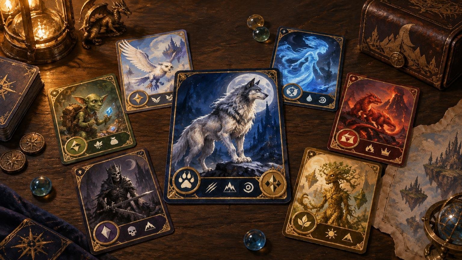
Table of Contents
The best custom token art does two jobs at once: it gives the deck a recognizable visual identity, and it tells everyone what the token is before somebody has to lean across the table. If the creature type disappears into a filigreed frame or the power and toughness are printed in moonlight-gray over a silver cloak, the art has won a battle the token needed to win.
Start with recognition, then decorate. A player looking across a Commander battlefield should be able to identify the token’s name or creature type, power and toughness, and important abilities in a few seconds. The illustration can establish mood and theme, but it should not become the only source of information.
Design for the game object, not just the illustration
Magic’s Comprehensive Rules define a token as a marker representing a permanent that is not represented by a card. The effect creating that token establishes its characteristics, including its name, subtypes, abilities, and power and toughness where applicable. Illustration has no rules effect: wings in the artwork do not give a creature flying.
That distinction gives custom artists plenty of creative freedom, but it also creates a practical responsibility. If the creating effect produces a 2/2 green Wolf creature token, the physical marker should make “Wolf” and “2/2” easy to find. A celestial fox painting may fit the deck beautifully, but players should not have to infer the actual creature type from its ears.
Build a visual hierarchy that survives a crowded table
Treat the token as a small information display. Each element should have a clear priority rather than competing at the same volume. For most creature tokens, use this order:
- Creature type or specific token name
- Power and toughness
- Rules-relevant abilities, such as flying, vigilance, menace, or deathtouch
- Color or other category indicators
- Artwork, set dressing, flavor text, and decorative marks
The first two items need prominent, predictable locations. Put the creature type in a stable title or type line, and reserve a high-contrast lower corner for power and toughness. Do not make players search the border for a tiny “1/1,” especially when the deck can create the same creature type at several sizes.
Specific names require extra care. Some effects create tokens with a particular name, while generic creature-token names are commonly derived from their subtypes. If a card creates a named token such as Boo, print that name clearly rather than relying on the creature type alone.
A familiar frame structure can help because players already know where to look. It does not have to imitate an authentic card, but the information should occupy recognizable zones. The same principle applies when choosing among full-art, ornate, and traditional frame approaches: originality is useful until it starts charging a readability tax.
Make the artwork support recognition
A token illustration reads fastest when it has a strong silhouette and one obvious subject. A single Soldier holding a shield is easier to identify than six overlapping figures inside a storm of banners, particles, and glowing runes. Save the cinematic crowd scene for a playmat; the token has less real estate and more work to do.
Use repeated visual motifs to connect tokens from the same deck. A spirit-themed build might share pale rim lighting, translucent fabric, and circular halos. A machine army might use angular shapes, riveted borders, and a restrained metallic palette. Keep the subjects distinct, though. Soldier, Knight, Spirit, and Angel tokens should not become four variations of the same armored silhouette.
Color can reinforce identity, but it should not carry identity by itself. A red corner, green border, or blue aura may be a helpful secondary cue, yet differences in lighting, sleeves, printing, and color perception can weaken that cue. Pair color with text, shape, icons, or frame structure.
Use contrast as a practical design tool
Small card text needs more contrast than it appears to need on a bright monitor. As a useful accessibility benchmark, the W3C contrast guidance specifies a 4.5:1 minimum contrast ratio for normal-sized text and 3:1 for large text. These are web accessibility thresholds, not official Magic token-production rules, but they provide a sensible target when text is rendered over an image.
Busy artwork behind text is one of the quickest ways to lose legibility. Darken, blur, fade, or fog the image beneath the type line and rules box. A modest opaque panel usually looks better in play than a beautifully integrated text box nobody can read. The art does not need to remain equally vivid in every square millimeter.
- Use light text on a consistently dark panel or dark text on a consistently light panel.
- Add a solid or translucent field behind power and toughness instead of placing the numbers directly over art.
- Avoid thin decorative fonts for small rules text and creature types.
- Check the design in grayscale so important categories are not distinguished only by hue.
- Reduce frame ornaments near numbers, ability icons, and type labels.
- Print a test at final size; zooming out on a monitor is not a reliable substitute.
Write only the rules information players need
Simple tokens usually need a name or creature type, color cue, and power and toughness. Add an ability line when the token has flying, haste, vigilance, or another relevant ability. The goal is not to recreate every possible rules explanation; it is to prevent memory disputes and repeated card lookups.
Noncreature and double-faced tokens need a more deliberate layout. Treasure, Food, Clue, Blood, Powerstone, Map, Junk, Lander, and Mutagen tokens have rules-defined characteristics or abilities. Incubators transform, while Role tokens are Auras with distinct effects. A decorative object and a one-word label may be insufficient when the token’s text changes how it can be used.
Create a token system, not ninety unrelated mini-posters
Coherence comes from rules that repeat. Choose one location for creature type, one stat treatment, one icon style, and a limited family of frames. Then let the illustrations provide variety. This gives the set a shared visual language without forcing every token to use the same composition.
A useful design system might assign rounded frames to creatures, angular frames to artifact tokens, and ribbon labels to enchantment tokens. Within the creature group, power and toughness always stay in the lower-right corner and keyword abilities always appear beneath the type line. Once players learn the system, they can scan the battlefield instead of decoding each card from scratch.
This matters most in decks that produce many token categories. If every Squirrel, Treasure, Food, Map, and Role uses a completely different frame, the battlefield starts resembling an art fair where somebody misplaced the labels. Pick two or three repeating devices and let them do the organizational work.
Run a battlefield-distance readability test
Do not approve a token solely from the design canvas. Print a rough draft at intended size, sleeve it if that is how it will be played, and place it among several cards and tokens. Then inspect it from a normal seated distance under ordinary room lighting.
- Look at the token for three seconds and identify its type, stats, and abilities.
- Place two mechanically different tokens beside it and check whether they can be confused.
- Rotate the card or partially cover it to simulate a crowded battlefield.
- Group several copies together and confirm that counters remain visible.
- Ask another player to read it without first explaining the visual system.
- Revise the smallest or slowest piece of information before polishing decorative details.
For digital construction, compare tools in this guide to MTG proxy card builders for custom designs. Once the layout is settled, custom MTG card printing and physical playtest cards can provide a route from the finished file to a tabletop copy. Confirm the current file, bleed, image, and ordering requirements before preparing final artwork.
Use artwork you have the right to use
Finding an image online does not make it available for a token project. The U.S. Copyright Office’s guidance for visual artists explains that original illustrations, photographs, and graphic art can receive copyright protection, with copyright owners controlling activities including copying, adaptation, distribution, and public display.
Use original art, properly licensed assets, verified public-domain material, or artwork covered by clear permission. Keep the license or written permission with the project files. The Library of Congress copyright guidance recommends identifying the exact asset, intended use, context, and duration when requesting permission.
Commissioned art also needs written terms. Paying an artist does not automatically transfer every copyright or grant unlimited commercial rights; work-made-for-hire treatment applies only in limited qualifying circumstances and involves written-agreement requirements. Specify whether the art may be printed, altered, shared, sold, or used in promotional images, and make sure the artist keeps the credit required by the agreement.
Let clarity carry the theme
Custom token art succeeds when the theme is memorable and the game state remains obvious. Establish the creature type first, make the stats impossible to miss, isolate rules text from busy artwork, and repeat the same information structure across the set. Then add the moonlit wolves, stained-glass Spirits, clockwork Soldiers, or suspiciously well-dressed Squirrels.
If a decorative choice makes a token slower to identify, simplify it. The most expressive token is not necessarily the one with the most ornament. It is the one that looks unmistakably yours while still telling the whole table exactly what it does.
Frequently Asked Questions
What information should be most prominent on a custom creature token?
Prioritize the specific token name or creature type, power and toughness, and any relevant abilities. Color, artwork, flavor text, and decorative marks should support that information rather than compete with it.
Can token artwork communicate an ability such as flying?
It can reinforce the idea, but it cannot replace the ability text. Illustration has no rules effect, so wings do not grant flying unless the token’s characteristics include that ability.
What contrast should custom token text use?
As a practical accessibility benchmark, aim for at least 4.5:1 contrast for normal-sized text and 3:1 for large text. These are W3C accessibility thresholds, not official Magic token-production rules.
How should I test token readability before final printing?
Print the design at its intended size, place it among other cards and tokens, and inspect it from a normal seated distance. Check whether another player can quickly identify its type, stats, and abilities without an explanation.
Can I use artwork found online for a custom token?
Not merely because it is publicly visible. Use original art, properly licensed assets, verified public-domain material, or artwork covered by clear written permission, and keep the relevant license or permission with the project files.
References
- media.wizards.com
- Understanding Success Criterion 1.4.3: Contrast (Minimum) | WAI | W3C
- What Visual and Graphic Artists Should Know about Copyright | U.S. Copyright Office
- Using Items from the Library’s Website: Understanding Copyright | Security, Copyright, and Privacy | Legal | Library of Congress