How to Build a Themed MTG Commander Deck That Looks Like One Set
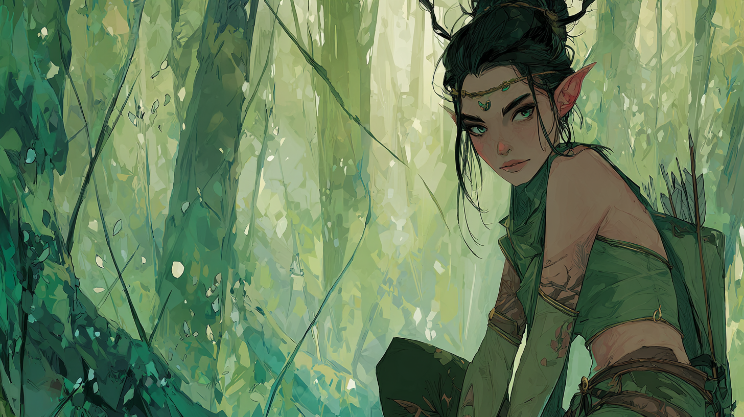
Table of Contents
TLDR
- Pick one “base” frame family for 70 to 90 cards. Consistency beats novelty, every time.
- Lock a tight color palette (3 main colors + 1 accent) and stop letting random card art bully you.
- Choose one art mood (bright heroic, grimdark, dreamy, comic, painterly) and enforce it like a tiny art director.
- Use a simple “set structure”: Base cards + one special insert treatment + a few mythic showpieces.
- Theme your staples first (lands, rocks, removal). If those match, the deck reads as cohesive even if the last 12 cards are “close enough.”
You know the feeling. You sit down with a “themed” Commander deck, shuffle up, fan your opening hand, and it looks like five different Etsy shops got into a bar fight. The deck still plays fine, sure, but visually it has the energy of a junk drawer.
A themed Commander deck that looks like one set is not about having every card share a literal set symbol. It’s about repeating the same few style decisions until your deck stops looking like an art salad and starts looking intentional.
What “looks like one set” actually means
A real MTG set has rules, even when you don’t notice them:
- A consistent frame language (where your eyes find mana cost, type line, text).
- A consistent color story (even across wildly different cards).
- A consistent art direction (lighting, texture, level of realism, vibe).
Your deck can copy that same structure with three choices:
- Palette rules
- Mood rules
- Frame rules
Everything else is just enforcing those rules when you get tempted by a random gorgeous print.
The 10-minute Style Bible (steal this and pretend you invented it)
Before you hunt down a single card version, write a tiny “style bible” for your deck. Yes, this sounds dramatic. That’s the point. Drama creates consistency.
1) Choose an anchor
Pick one of these as your anchor:
- Your commander art (best choice if the commander is the whole vibe)
- Your basic lands (best choice if you want the battlefield to look uniform)
- One signature card you cast every game (Sol Ring, Rhystic Study, a pet finisher)
Your anchor is what you reference when you’re unsure. If a new card’s art doesn’t match the anchor, it’s out. Be strong.
2) Lock a palette that can survive 100 cards
Use this rule: 3 core colors + 1 accent + neutrals.
Examples:
- Core: charcoal, bone, deep red. Accent: gold. Neutrals: black, off-white.
- Core: teal, violet, midnight blue. Accent: neon pink. Neutrals: black, gray.
Practical tip: if your palette includes two bright accents, your deck will start screaming at you from across the table. Fun once. Exhausting forever.
3) Pick one mood and name it like a film genre
This is the part people skip, then wonder why the deck looks messy.
Pick one:
- Gothic horror (high contrast, candlelight, fog, old stone)
- Mythic epic (bright heroic lighting, marble, gold, clean shapes)
- Neon tech (glow, holographic highlights, sharp silhouettes)
- Storybook (soft edges, painterly, warm light, whimsical detail)
- Metal album cover (dramatic lighting, hard shadows, “everything is a threat”)
If you can’t describe your deck mood in two words, it’s probably “random.”
4) Decide your frame system (the make-or-break)
If you want “one set” cohesion, you need a repeatable frame rule. Here are three that actually work:
Option A: One-frame purity
- One frame family for almost everything.
- Your deck will look extremely cohesive.
- Tradeoff: you might sacrifice readability on text-heavy cards if the frame style is busy.
Option B: Base set + insert sheet (my favorite)
- 70 to 90 cards in your “base” frame family.
- 10 to 25 cards in one special treatment (like “spell inserts”).
- This mimics how real sets feel cohesive while still having spice.
Option C: Roles by card type
- Lands in one treatment.
- Instants and sorceries in one treatment.
- Permanents in one treatment.
- Still cohesive if you commit hard, but you are basically designing your own visual UI system.
If you only remember one thing: choose a frame system that you can explain in one sentence. If you need a flowchart, you are about to build an art salad.
The One-Set Framework: Base cards, inserts, mythics
Here’s a clean structure that makes a Commander deck feel like it came from one product release.
| “Set” slot | How many cards | What it’s for | What to watch out for |
|---|---|---|---|
| Base set | 70–90 | The main identity, most of your deck | Don’t mix multiple base frames “because variety” |
| Insert sheet | 10–25 | A consistent secondary treatment (spells, sagas, alt-frame staples) | Keep it to ONE insert style |
| Mythic showpieces | 3–8 | Commander + a few spotlight cards | Too many “special” cards stops feeling special |
This is the secret sauce: cohesion comes from constraints, not from having “cool versions of everything.”
Style rules that keep your deck readable in real games
A deck that looks cohesive but plays like a squint test is a tragedy. Here are the style rules that protect gameplay:
- High contrast text boxes win. If the rules box blends into the art, your deck becomes a table-hostage situation.
- Keep mana costs obvious. If someone can’t identify costs at a glance, games slow down.
- Use your fanciest frames where rereads are rare. Instants and sorceries can be ornate. A permanent that sits in play for eight turns should be easy to parse.
- Don’t let “dark aesthetic” erase information. Grim vibes are great. Unreadable black-on-charcoal is not.
If you want a fast way to pick frame families with readability in mind, use your deck’s job:
- Battlefield deck (engines, creatures, board states): pick structured frames.
- Spells deck (storm, control, big stacks): you can afford a more decorative spell treatment.
Theme starter packs: pick one and commit
These are “starter packs” in the sense of style direction, not a shopping list that forces you to remortgage your playmat.
1) Neon Tech (cyber glow)
- Palette: black, graphite, teal. Accent: neon magenta
- Mood: futuristic, crisp silhouettes, glow highlights
- Frame rule: clean modern base frame, plus a neon showcase insert for spells
- Works great for: artifacts, vehicles, ninjas, “I swear this combo is fair” decks
2) Gothic Horror (candlelight and bad decisions)
- Palette: charcoal, bone, deep crimson. Accent: tarnished silver
- Mood: fog, old stone, dramatic shadows, creepy elegance
- Frame rule: classic structured base frame, with a parchment-like insert for sorceries and removal
- Works great for: vampires, zombies, aristocrats, reanimator, anything that “drains”
3) Mythic Marble (Greek statue energy)
- Palette: white, gold, sea blue. Accent: emerald
- Mood: heroic, clean light, divine motifs, big shapes
- Frame rule: bright “mythic” base frame, with constellation-style inserts for enchantments
- Works great for: enchantress, gods, voltron, “my commander is a monument”
4) Noir Deco (fancy crimes)
- Palette: black, cream, brass. Accent: teal
- Mood: art deco geometry, spotlight lighting, smoky atmosphere
- Frame rule: deco base frame, plus a gilded “spotlight” treatment for your mythics
- Works great for: treasure, politics, value piles that pretend they are “midrange”
5) Frost Runes (Norse winter)
- Palette: ice blue, steel, pine green. Accent: warm amber
- Mood: runes, snow, cold light, rough textures
- Frame rule: rune-styled base frame, with saga-style inserts for story moments
- Works great for: elves, snow themes, big monsters, “nature is angry” decks
6) Expedition Relics (ancient maps and treasure)
- Palette: sandstone, jungle green, sun-baked orange. Accent: turquoise
- Mood: adventure, carved stone, lost temples
- Frame rule: expedition base frame, plus full-art lands as your “premium basics”
- Works great for: landfall, exploration, dinosaurs, rampy decks that want the battlefield to look like a travel poster
7) Cosmic Horror (space, void, existential dread)
- Palette: midnight blue, black, ultraviolet. Accent: sickly green
- Mood: stars, impossible geometry, surreal lighting
- Frame rule: minimal base frame with high contrast, plus an ornate “spell page” insert for tutors and counters
- Works great for: control, mill, Eldrazi vibes, “I brought interaction” decks
8) Old-School Classic (clean, structured nostalgia)
- Palette: warm neutrals, muted primaries, aged parchment
- Mood: classic fantasy illustration, grounded lighting, readable zones
- Frame rule: one consistent retro-style base frame for everything
- Works great for: creature combat, toolbox decks, tables that appreciate clarity over flash
The fastest way to make it cohesive: theme your staples package first
Your staples show up in almost every Commander deck:
- lands
- mana rocks
- card draw engines
- flexible removal
If those 25 to 40 cards share a consistent style, the whole deck reads as unified. Even if the last 10 synergy cards are “close enough,” nobody notices, because the deck’s visual foundation is doing the heavy lifting.
This is also why custom MTG proxies are so useful for themed decks. You can standardize the boring-but-necessary cards so your theme doesn’t fall apart the second you add Command Tower.
Common mistakes that kill the “one set” illusion
- Every card is a special frame. That’s not a set, that’s a scrapbook.
- You mixed three palettes. Your deck is now arguing with itself.
- Your basics don’t match. Nothing breaks cohesion faster than five random land arts.
- Your “dark theme” made the text unreadable. Cool vibe, now please explain your board state every turn.
- You changed frame rules halfway through. We all do this. It’s still wrong.
Quick checklist before you order or print
- Does your deck have one base frame family?
- Do you have one insert treatment, or none?
- Is your palette 3 core + 1 accent?
- Do your basics match the deck mood?
- Can someone read your commander from across the table?
If you can answer “yes” to most of that, your deck will look like a product. In the best way.
FAQs
How many frame styles can I use and still look cohesive?
Two is safe, three is possible if one is only for a tiny “mythic showpiece” slice. More than that and you are building a collage.
What if I can’t find every card in the same style?
Make your staples and lands match first, then let a few oddballs slide. Your brain will forgive the last 10 percent if the first 90 percent is consistent.
Should my commander be the fanciest version?
Usually, yes. Your commander is the face of the deck, so it’s the best place for a “mythic showpiece” treatment.
How do I keep a themed deck readable for opponents?
Prioritize contrast and clear text zones, especially for permanents that stick around. Ornate frames are fine for spells that resolve and leave.
What’s the easiest theme to make look cohesive?
A one-frame retro or structured look is the simplest. It hides a lot of art variation because the layout stays consistent.
Links
External: Scryfall search, frame:showcase
Internal: Full Art vs. Mystical Archive vs. Vintage: Choosing MTG Frames That Read Fast In-Game
Internal: Shop all custom MTG proxies
External: Collecting Strixhaven: School of Mages (Mystical Archive frames)
External: MTG Wiki, Showcase frames overview