
Theme Beyond the 100 Cards: Matching Lands, Tokens, and Deck-Box Presentation
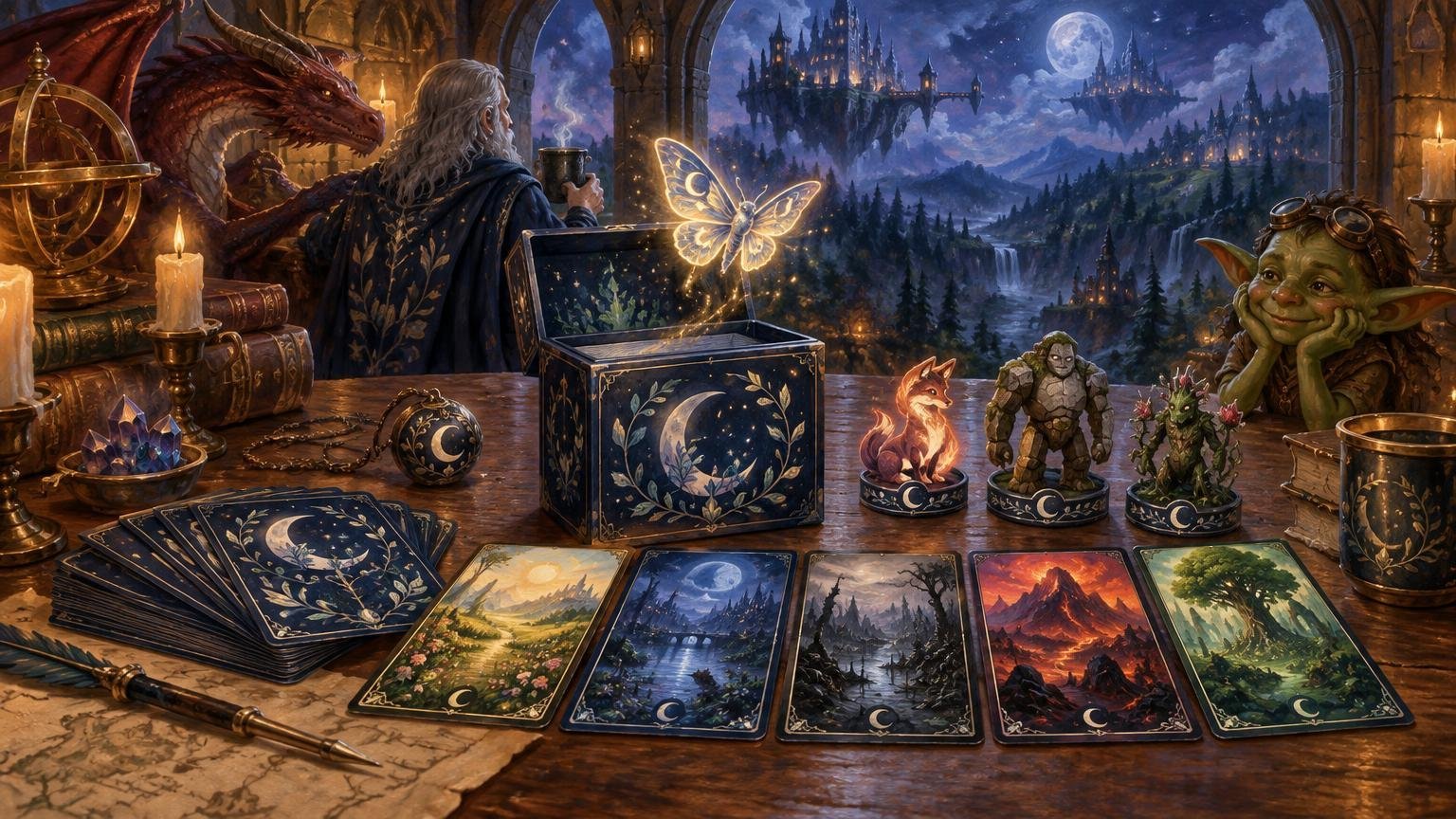
Table of Contents
A matching lands tokens deck box commander theme works best when it behaves like a visual system, not a demand that every object display the same illustration. Start with the commander and the deck’s actual gameplay needs. Coordinate the lands and frequently used tokens next, then choose sleeves and a deck box that frame the theme without competing with it.
That order matters. Lands and tokens carry game information, so they must remain recognizable across a multiplayer table. Sleeves and storage can reinforce the mood more quietly. The result should feel intentional when you unpack it, but it should also let opponents identify a Forest, Treasure, or 2/2 creature token without conducting an art-history seminar.
Define one visual brief before matching anything
A visual brief is a one-sentence rule for what belongs in the project. It prevents the common problem of buying several individually attractive components that have nothing to say to one another.
Choose one primary source for the theme:
- Commander-led: repeat the commander’s architecture, clothing, magic effects, symbols, or emotional tone.
- Setting-led: build around a recognizable environment such as a haunted coast, overgrown ruin, celestial library, or industrial city.
- Archetype-led: express what the deck does through motifs such as sacrifice, artifacts, counters, enchantments, or graveyard recursion.
- Material- or palette-led: connect components through parchment, stained glass, ink drawing, neon accents, dark metal, or another controlled treatment.
Keep this visual choice separate from color identity. Commander color identity determines which cards can go into the deck; a visual palette determines how the physical project looks. A blue-black deck can use warm copper borders or pale botanical art as long as the actual cards remain legal and their game information stays clear. The official Commander format overview covers the format’s 100-card construction, singleton rule with the basic-land exception, and color-identity restriction. For a deeper planning method, use the guide to building a Commander visual theme around a small color palette.
Give each component a different visual job
Cohesion does not require equal intensity everywhere. In fact, assigning every component the same visual volume often creates noise. A useful hierarchy gives the commander the strongest focal treatment, lands a repeated foundation, tokens clear battlefield roles, and accessories a quieter framing function.
- Commander: the focal point and clearest statement of the theme.
- Basic lands: the repeating background rhythm that ties many draws together.
- Tokens: functional supporting pieces that must be distinguished quickly.
- Sleeves: a consistent field around every card, best used for color, texture, or a restrained motif.
- Deck box: the exterior title card, where a bolder symbol or illustration creates little gameplay friction.
This hierarchy also gives you permission not to customize all 100 cards. A commander, coordinated basics, accurate recurring tokens, and a fitting outer presentation can establish a stronger identity than ninety-nine unrelated alternate-art treatments.
Build a matching lands tokens deck box commander theme in the right order
1. Stabilize the deck before ordering repeated pieces
Playtest the list until its broad structure is settled. You do not need to declare the deck finished forever, but you should know its colors, mana requirements, principal token effects, and likely commander. Otherwise, a routine deck revision can leave you with the wrong mix of basics or a beautiful stack of tokens the deck no longer creates.
For a deck that is still changing heavily, inexpensive paper inserts may be enough. If you need a physical version of the complete list for repeated testing, consider custom card printing for a full test deck before spending the project budget on coordinated finishing pieces. Reserve elaborate lands, signature cards, and accessories for the version that has survived those revisions.
2. Coordinate basic lands around recognition first
Basic lands are powerful theme carriers because they recur throughout the deck and battlefield. They are also mana sources, so their type should be obvious at a glance. Keep the land name, mana symbol, or an unmistakable environmental cue prominent. If Plains and Islands use nearly identical pale panoramas with tiny labels, the set may match perfectly while playing poorly.
Variation within a shared art direction is usually more useful than one image repeated across every mana type. A setting-led deck might show the same city through distinct districts: open courtyards for Plains, canals for Islands, crypts for Swamps, foundries for Mountains, and gardens for Forests. Shared architecture creates unity; terrain, lighting, and symbols preserve identification.
Match the quantities to the tested mana base rather than changing the mana base to fit an attractive land bundle. The detailed guide to custom basic lands in Commander offers more help balancing thematic intensity against visible mana cues.
3. Inventory tokens before designing them
Make a token inventory from the current deck list. Read every card that creates a creature token, artifact token, copy, emblem, or other recurring game piece. Then sort the results by how often they appear and how much battlefield space they are likely to occupy.
Prioritize recurring, board-prominent pieces. A deck that repeatedly creates Treasures and 1/1 creature tokens benefits more from clear versions of those pieces than from an elaborate token produced by one situational card. There is no universal correct quantity: token needs change with the deck’s effects, how long tokens remain in play, and whether counters or dice are used to represent multiples.
Each token should clearly communicate the information players need, including its name or type, power and toughness when applicable, and relevant rules text or abilities. Theme can control the border, illustration, icon style, and palette, but it should not erase functional differences.
The Commander token-package planning guide can help turn the card list into a practical inventory rather than a guess.
Keep similar tokens visually distinct
Treasure, Clue, and Food are an easy stress test because one deck may create all three. Giving them identical gold frames and similarly shaped glowing objects makes the package cohesive but slows down every activation decision.
Use at least two distinct signals for each recurring token. Those signals might include a large label, unique silhouette, dedicated accent color, different border icon, or clearly different composition. For example, Treasure might use angular gold forms and a warm highlight; Clue could use paper, lenses, and a cool blue accent; Food might use rounded forms and a green or red accent. The illustration style remains shared while the game objects remain unmistakable.
Creature tokens need similar discipline. If the deck creates both 1/1 flying Spirits and 1/1 ground creatures, the Spirit art should not rely on tiny rules text to communicate flying. An open sky, elevated composition, wing or vapor motif, and visible keyword provide redundant cues. Redundancy is helpful when cards are partially covered, viewed sideways, or seen from several feet away.
Let sleeves and the deck box frame the cards
Choose accessories after you know what the cards and tokens look like. Matching does not have to mean reproducing the commander art on every surface. It can mean repeating one accent color, symbol, material impression, or geometric motif.
Sleeves appear around every card, so a restrained choice often works best. If the deck already contains ornate frames, highly saturated lands, and detailed tokens, a quieter sleeve can give those elements room to breathe. If the card treatments are restrained, the sleeve can carry more of the theme.
The deck box can be bolder because it does not communicate in-game characteristics. Treat it like a cover rather than another game piece. A single crest, landscape, creature silhouette, or title-like mark usually connects the package more cleanly than a collage of every visual idea in the deck.
Plan organization at the same time. Tokens should be easy to locate without unloading the deck onto the table, and visually similar pieces should not depend on memory alone. Any dividers or labels can repeat the project’s typography or icon system while still using plain functional wording.
Run a table-view test before calling it finished
A component can look excellent in a close-up preview and become confusing during a four-player game. Assemble a small test battlefield containing the commander, several basic-land types, the most common tokens, and a few sleeved cards. View it under ordinary room lighting from the distance and angle another player would normally see it.
Check the following questions:
- Can each basic-land type be identified without reading small text?
- Can the commander be found immediately among the other permanents?
- Do creature and noncreature tokens look meaningfully different?
- Are tokens with different abilities or power and toughness easy to separate?
- Do the sleeves support the palette, or do they introduce a competing color and motif?
- Does the box look like it belongs to this deck without needing to repeat every illustration?
- Can an opponent understand the board without repeatedly picking up custom cards?
If the answer to one of these is no, simplify the weakest component rather than redesigning everything. Enlarging a token label, changing one accent color, or selecting a calmer sleeve may solve the problem. A visual system succeeds through consistent relationships, not perfect duplication.
Keep custom presentation transparent in casual play
Custom lands, tokens, and playtest cards are best approached as transparent tools for casual, proxy-friendly play rather than substitutes presented as authentic Wizards-printed cards. Trinket Kingdom’s current materials frame its custom cards around casual games, cubes, personal deckbuilding, and similar uses, and distinguish that positioning from official affiliation.
Acceptance can still vary by playgroup, store, event, or organizer. Mention unofficial custom cards before the game, keep card identities and rules information clear, and bring an easy reference when an unfamiliar treatment could cause confusion. Wizards’ published proxy-policy discussion draws a narrow distinction around sanctioned events and does not make unofficial playtest cards generally valid for sanctioned competition.
Finish the deck from the battlefield outward
The practical sequence is simple: settle the list, define one visual brief, coordinate readable basics, build the token package, and then select sleeves and storage. Spend the strongest visual treatment on the commander and the clearest functional treatment on anything opponents must identify during play.
Before adding another decorative element, ask the useful question: does it make the deck more expressive without making it harder to play, organize, or understand? If it does, it belongs. If it only makes four different tokens look like the same glowing object, let that particular trinket remain in the kingdom.
Frequently Asked Questions
What should I match first in a themed Commander deck?
Settle the deck list and define one visual brief first. Then coordinate readable basic lands and frequently used tokens before choosing sleeves and a deck box.
How can themed basic lands remain easy to identify?
Give each land type prominent identifying cues, such as its name, mana symbol, distinct terrain, lighting, or other unmistakable visual signals.
Which tokens should I bring with my Commander deck?
Inventory the tokens the current list creates, then prioritize recurring and board-prominent pieces. The right quantity depends on the deck’s effects, how long its tokens remain in play, and whether dice or counters represent multiples.
How can similar tokens stay visually distinct?
Use at least two distinguishing signals for each recurring token, such as a large label, unique silhouette, dedicated accent color, border icon, or clearly different composition.
Can I use custom lands or tokens at a local Commander night?
Acceptance varies by playgroup, store, event, and organizer. Disclose unofficial custom cards before playing, keep their identities and rules information clear, and do not assume unofficial playtest cards are valid for sanctioned competition.